Ben Sambrook - The National September 11 Memorial
Graphics & The Branding Language
Thursday, 15 December 2011
Evaluation
Overall this project has been very successful, I have learnt a huge amount about branding/brochure design and prepping a brochure to print back to back. I feel the logo I have designed for the National September Memorial is fit for purpose as I have reasoned the way it is designed with regards to the square footprint of the towers and the uppercase text symbolizing architecture. I feel the brochure would work well in celebration of the memorial as it has imagery and facts from the towers and imagery and facts about moving on and regrowth of the memorial. As my ideas developed throughout the project I feel my skill in design also progressed as when finalising the brochure I realised that the first few spreads needed tweaking upto the standards of the rest of the brochure. I have thoroughly enjoyed this brief as I have been able to create a brochure with imagery, some of which I took myself and typography.
Wednesday, 14 December 2011
Friday, 9 December 2011
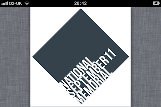
Designing a logo for this brief was quite difficult, at first I wanted to go with an organic theme. To use the fact that life goes on and regrowth happens, I wanted to use greenery to produce this. But after a page full of different ideas varying from trees to New York skylines I thought why not use the square from the foundation of the towers? I tried this and added a typeface to it but I felt it needed something else. I decided to put the square at an angle and incorporate a condensed uppercase typeface quoting 'National September 11 Memorial' but separated onto three lines. This then adds the theme of architecture and buildings into the logo.
I feel this logo works successfully as the brand identity for the memorial.
I feel this logo works successfully as the brand identity for the memorial.
Sunday, 4 December 2011
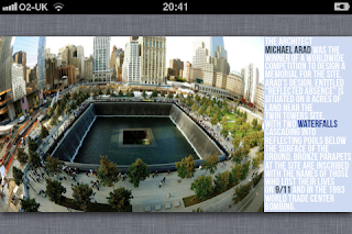
After several mock ups and redesigns the brochure is now complete. Here are two of my favourite spreads from the brochure
The first spread is the story of a survivor from the collapsing towers, I think the serif typeface adds to the feel and brings the 'American' feel into it. The black and white image of the man adds also creates a real attachment to him and the brochure.
The second spread is various facts and figures from the devastation of the September 11th, I have emphasized several key points and made them stand out a little more. This is also the center spread of the brochure and when opened up 210mm x 210mm it is able to lead you in and keep reading the facts
Wednesday, 16 November 2011
What is branding?
To understand branding, it is important to know what
brands are. A brand is the idea or image of a specific product or
service that consumers connect with, by identifying the name, logo,
slogan, or design of the company who owns the idea or image. Branding is
when that idea or image is marketed so that it is recognizable by more
and more people, and identified with a certain service or product when
there are many other companies offering the same service or product.
Advertising professionals work on branding not only to build brand
recognition, but also to build good reputations and a set of standards
to which the company should strive to maintain or surpass. Branding is
an important part of Internet commerce, as branding allows companies to
build their reputations as well as expand beyond the original product
and service, and add to the revenue generated by the original brand.
When working on branding, or building a brand, companies that are
using web pages and search engine optimization have a few details to
work out before being able to build a successful brand. Coordinating
domain names and brand names are an important part of finding and
keeping visitors and clients, as well as branding a new company.
Coordination of a domain name and brand names lends identification to
the idea or image of a specific product or service, which in turn lets
visitors easily discovery the new brand.
Branding is also a way to build an important company
asset, which is a good reputation. Whether a company has no reputation,
or a less than stellar reputation, branding can help change that.
Branding can build an expectation about the company services or
products, and can encourage the company to maintain that expectation, or
exceed them, bringing better products and services to the market place.
Friday, 21 October 2011
Brochure Mock Up
Really like the logo I have created for this project so set about getting some rough ideas together for a brochure, a mock up is imperative to get a grasp on how it might look when it's printed.
After making the mock up it's really made a difference to the things I have to redesign, firstly the die cut is far too big and I need a working grid system, secondly the text on the image is far too small and need to incorporate this into the same grid system.
After making the mock up it's really made a difference to the things I have to redesign, firstly the die cut is far too big and I need a working grid system, secondly the text on the image is far too small and need to incorporate this into the same grid system.
Subscribe to:
Comments (Atom)


